Rapid Iteration Testing and Evaluation of Tidepool Loop App with Child-Caregiver Dyads and Adults
Usability testing and rapid iteration of a simplified version of the Tidepool Loop automated insulin dosing app for children and their caregivers as well as adults with Type I Diabetes.
Impact
Identified unique needs of caregiver user group
Ensured that rapid iteration research rounds and prototype updates ran according to schedule and were incorporated into design insights and recommendations
Managed insights across four rounds of research and prototype updates and presented improvements and areas for continued research
Planning Fast-Paced Research Cycles
Implemented a start to finish research schedule for 4 rounds of research with 4-6 participants each over 4 months, managing scheduling and capacity of researchers, participants, and partnered insulin pump company
Unmoderated Study Management
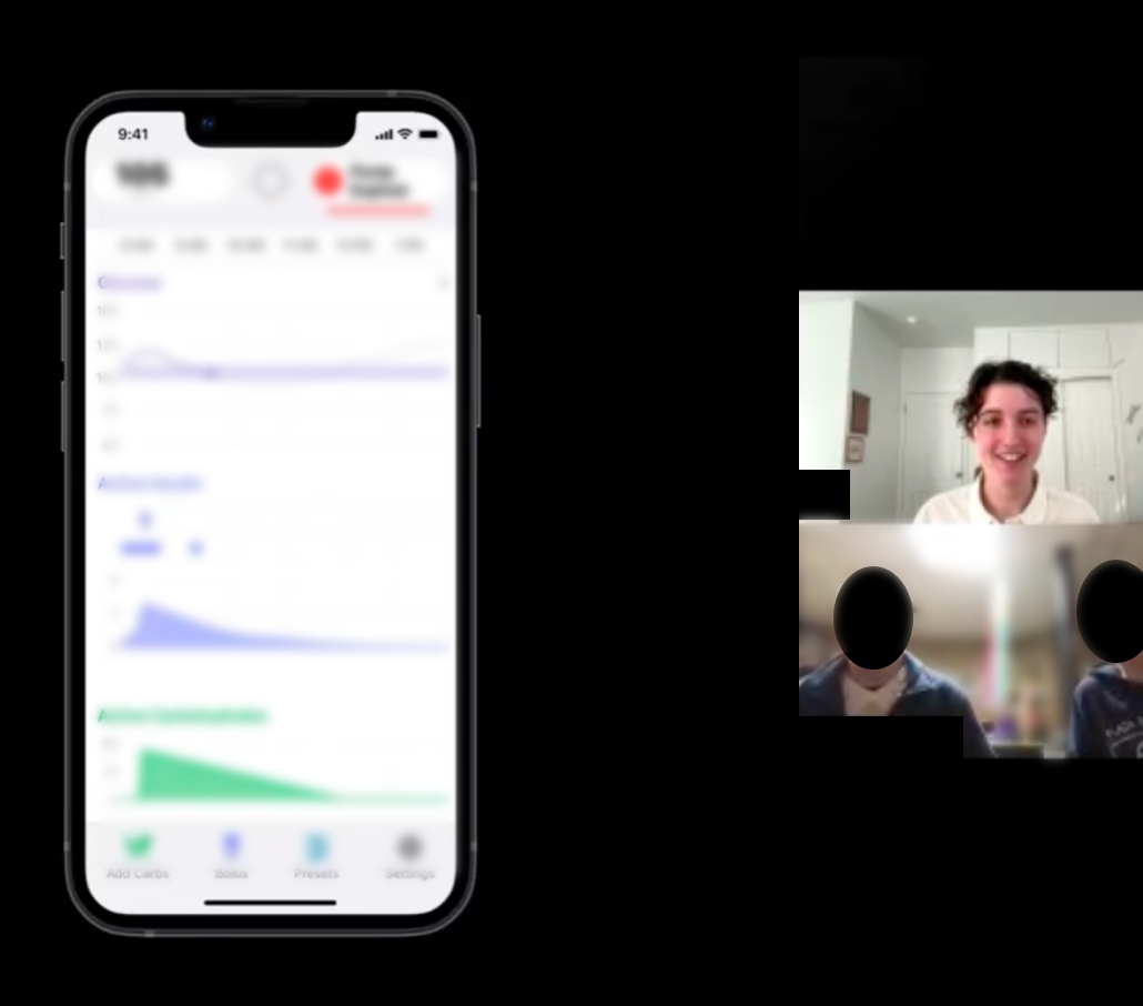
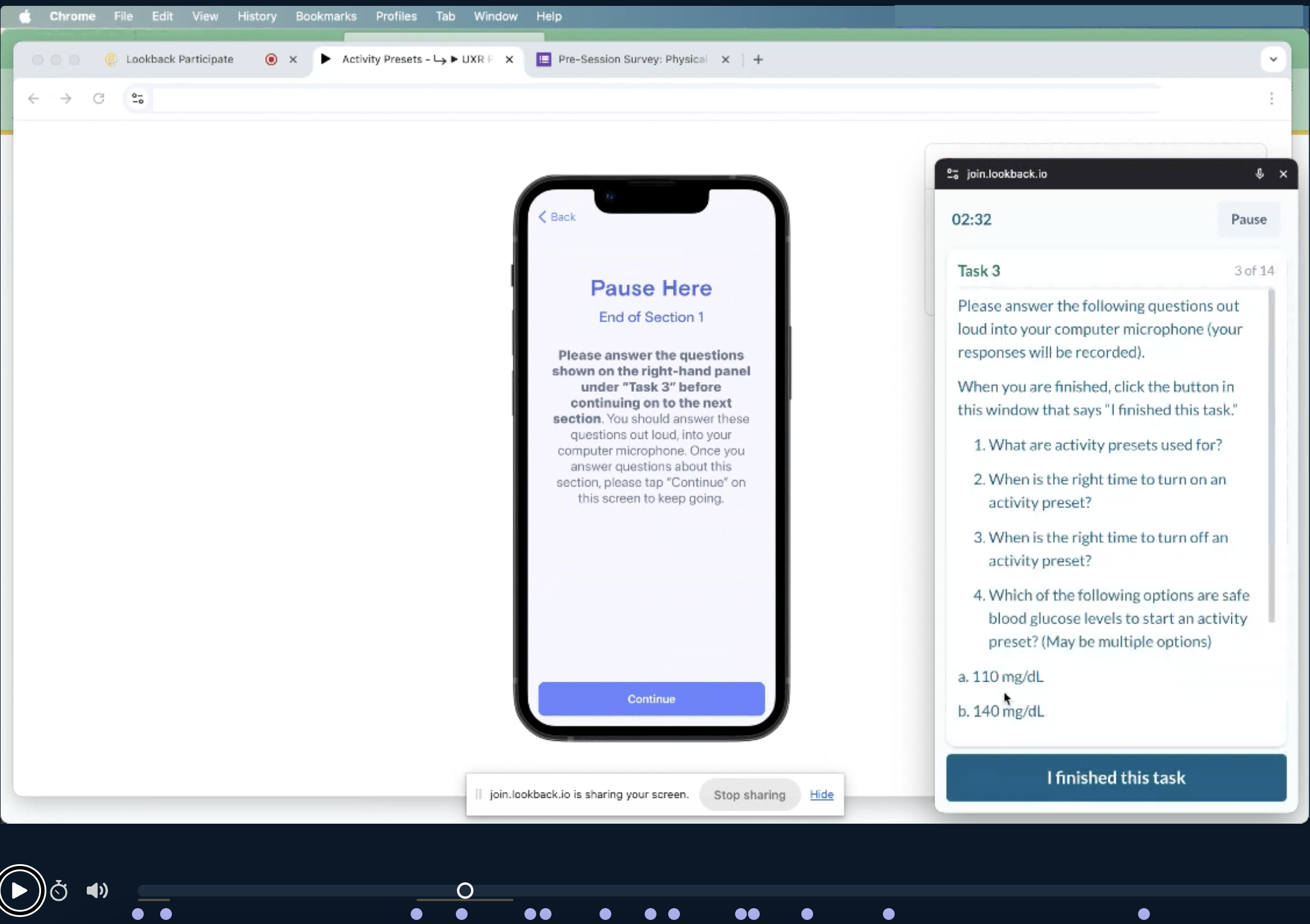
Set up asynchronous study sessions in Lookback for pre-study app onboarding and a post-study comprehension survey and monitored participants’ unmoderated sessions before and after their live session
Moderating with Adolescent Participants
Adapted the moderators guide to keep younger participants engaged, including introducing additional breaks and soliciting feedback directly from the adolescent participants when the caregiver was talking more
Design Recommendations and Task Performance
Identified usability related and risk related issues and made recommendations to the design team, including eliminating use errors and close calls for historically difficult tasks
RITE Method
The study consisted of four rounds, each containing 3-5 participants.
The RITE method was chosen for this project because the product had already undergone significant user testing. The product being tested was a simplified version of the Tidepool Loop app, and the team was testing some of the design changes that had been made.
RITE stands for Rapid Iteration Testing and Evaluation, and is one way to run testing on and quickly improve a prototype with a smaller amount of resources. The research sessions are run regularly with a smaller number of participants and each usability problem is identified, the prototype is updated, and it’s tested again with a new small set of participants. This process continues until no new usability issues are identified.
Adapting Study for Parent-Child Dyads
Changes Included:
Taking more frequent breaks, patient and prolonged root cause probing, and exploring the mental models of teens (which significantly differed from those of adult users)
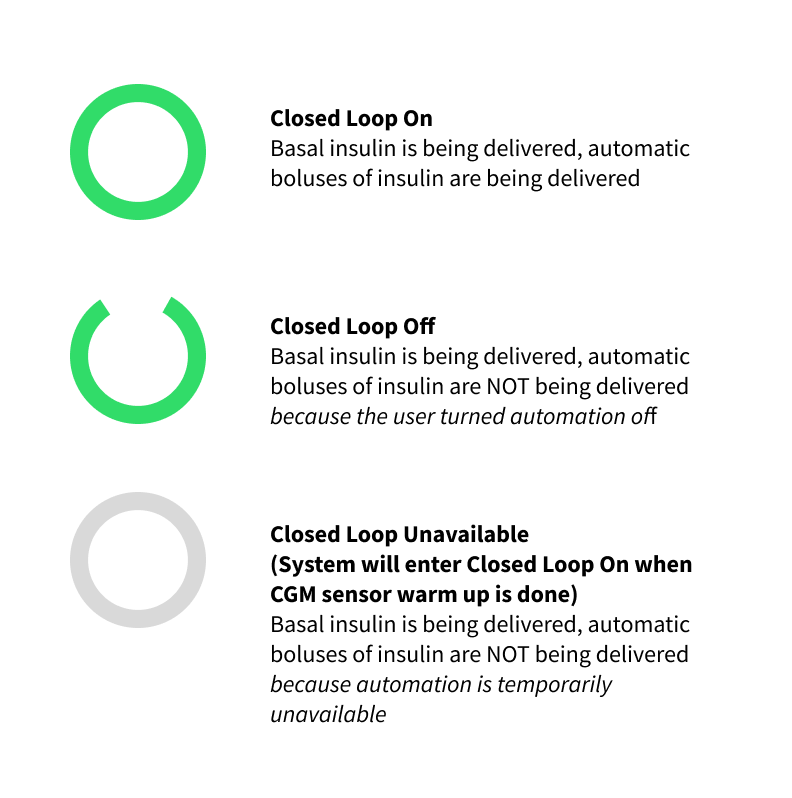
The problem: a hard-to-communicate automation status
When replacing a CGM it can take up to two hours to warm up. During this time, Tidepool Loop cannot automatically adjust insulin delivery based on CGM readings, because there are no CGM readings. During this time, the user receives scheduled basal insulin but not any automated boluses of insulin. As soon as the CGM warm up period is over, as long as the app is in “Closed Loop ON” mode, it will start automating and delivering boluses normally.
During the sensor warmup, the automation status is called “Closed Loop Unavailable,” and the status symbol is a gray closed loop. In this scenario, we tested the users’ comprehension of this status.
The gray circle represents the temporary “automation unavailable” status.
Four participants were unsure which automation status the gray circle represented, often confusing it with Closed Loop Off mode represented by an open green loop.
“To me it looks like [automation is] off because this isn’t green.”
– Research Participant A (Type II adult)
“That’s inconsistent with this indicator…I would assume this would be an open green.”
– Research Participant B (Type I adult)
Basal insulin is still being delivered during sensor warmup.
Three participants were unsure if their scheduled basal insulin was being delivered during sensor warmup with the gray closed loop.
“So everything is completely off. Except for the scheduled deliveries, I believe.”
– Research Participant C (Type I adult)
Design update 1: Clicking on the loop status icon brings up a modal explaining “automation is unavailable”
Most participants did not read the text closely and similar confusions remained in the next round of testing
Design update 2: Loop status icon pulses slightly during “automation is unavailable”
Increased number of participants who clicked on the symbol and read the text
Visually communicated the temporary status of “automation is unavailable” and reduced confusion