Understanding Users’ Mental Models of AID Apps to Redesign App Information Architecture
Unmoderated open card sort with 40 cards representing features of the Tidepool Loop automated insulin dosing (AID) app, conducted with adults experienced in using AID systems
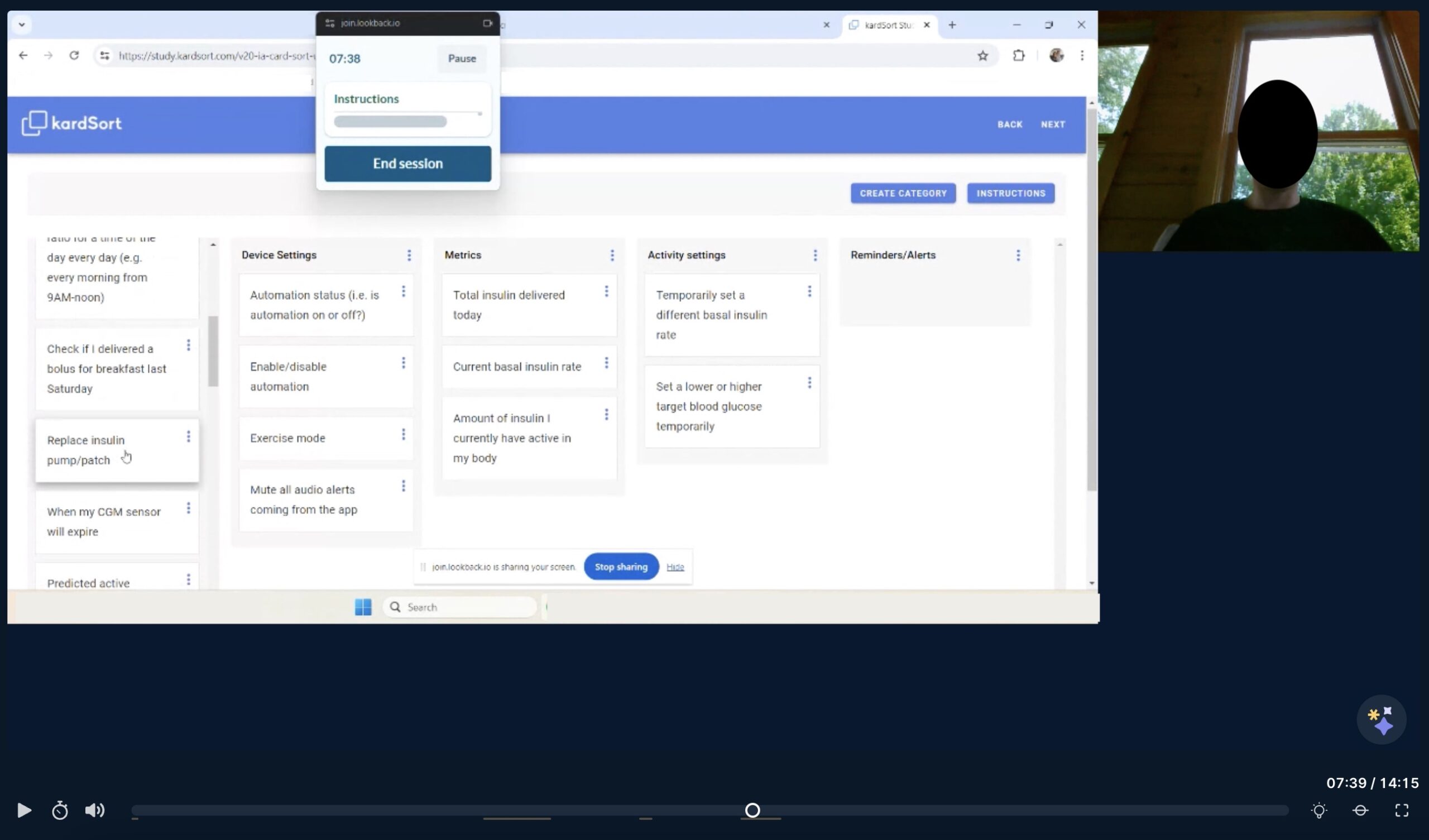
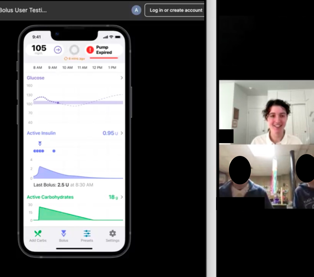
Screenshot of unmoderated study session
Ran the company’s first unmoderated study, setting a precedent and creating best practices for future studies
Uncovered insights about user expectations which will be used in support of design recommendations for a future version of the product
Conducted the company’s first card sort study using both qualitative and quantitative data analysis
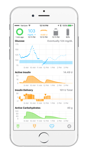
Background: Evolution of the "Loop" App
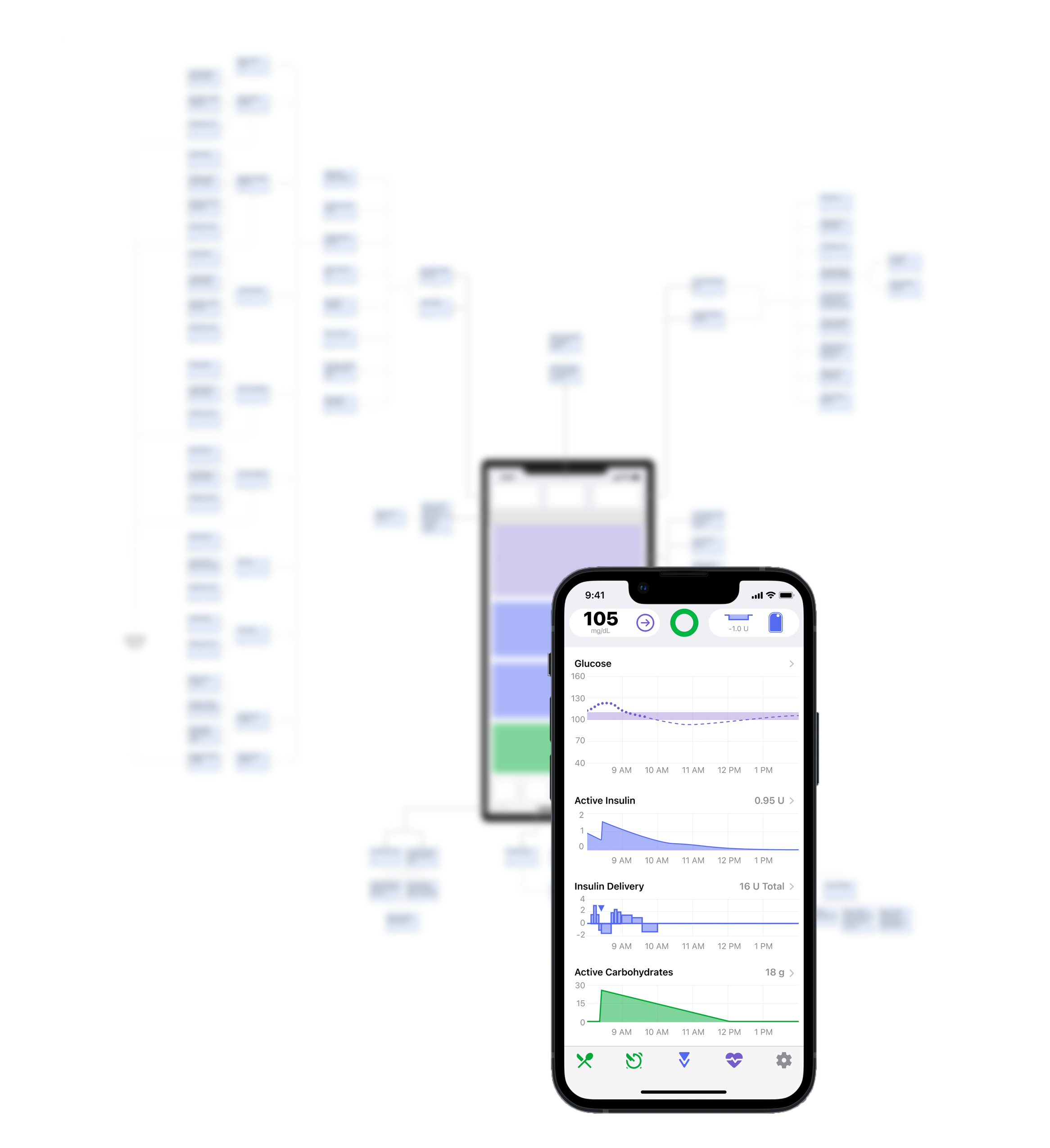
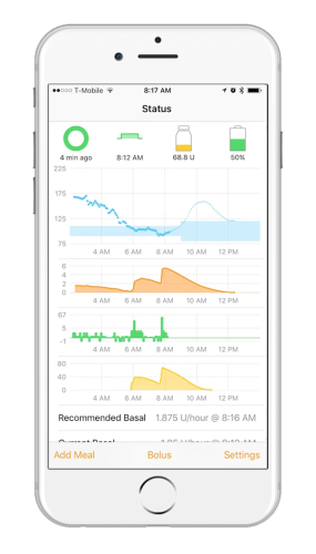
DIY Loop was a community-built open source code for an iPhone app that automates insulin delivery. Tidepool has been developing a FDA regulated version of the Loop app and iterating upon the original design since 2018.
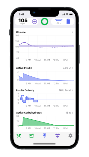
Key App Features
Hypotheses
We identified three common navigation issues over several usability studies. This card sort was conducted to understand users’ mental models to inform potential design changes to reduce navigation and usability issues.
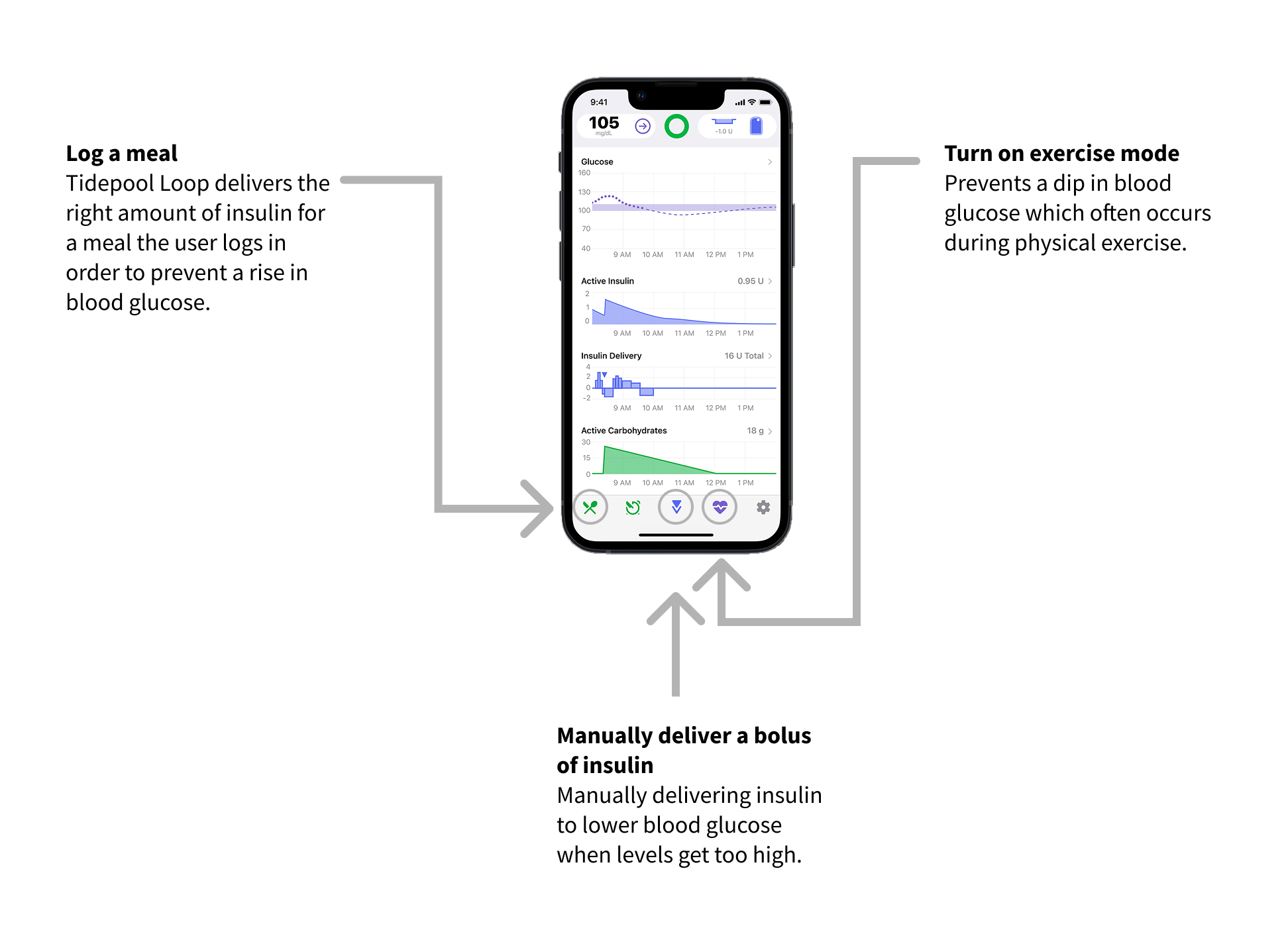
Hypothesis 1: users expect to be able to bolus (deliver insulin) using the same button every time
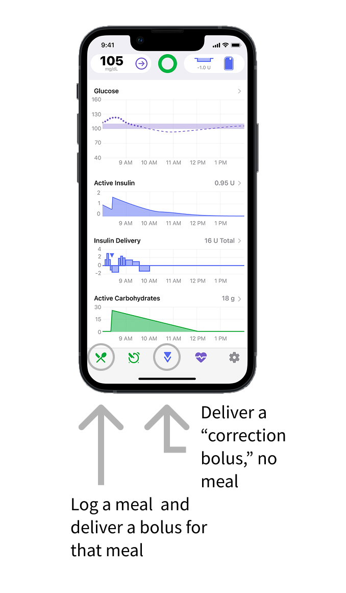
In the Tidepool Loop app, there is one button to log a meal and deliver a bolus for that meal, and a separate button to deliver a “correction bolus” when no food has been eaten.
“I just knew that I needed to take a bolus [for a meal] and that [the correction bolus button] is where I could do it.” – research participant who clicked the correction bolus icon instead of the meal entry icon to deliver a bolus for a meal.
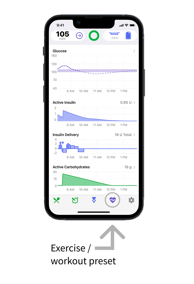
Hypothesis 2: Users don’t understand how exercise mode actually works which causes confusion about how to check if it’s enabled
In prior rounds of research, participants were asked to turn on the workout preset and then to explain how they knew that it was on. Very few participants said that the reason they knew that exercise mode was on because they saw that their blood glucose target was temporarily higher. This suggests that users may not understand what the workout preset does, and this contributes to difficulty in determining whether it’s on or off.
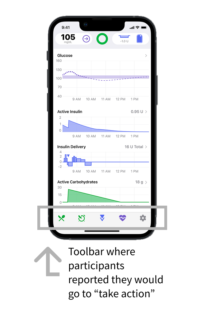
Hypothesis 3: users expect all “actions” to be in one place in the app, and all “settings” in a separate place.
“It would seem to me [that this is] entering information down here”
“For some reason I was thinking it was one of the ones [down in the toolbar]… it just seemed like these were the tools to take action.”
Study Setup
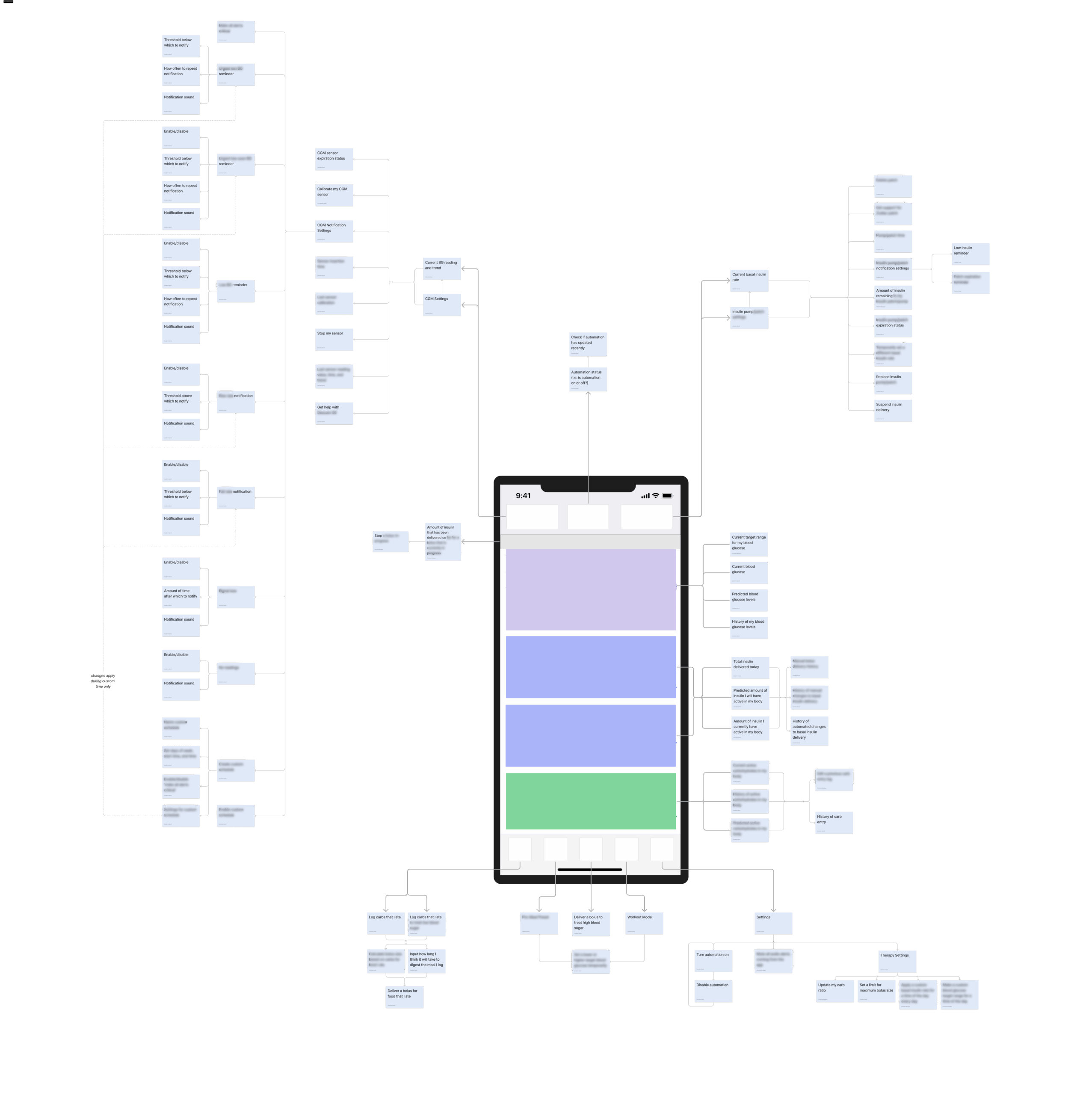
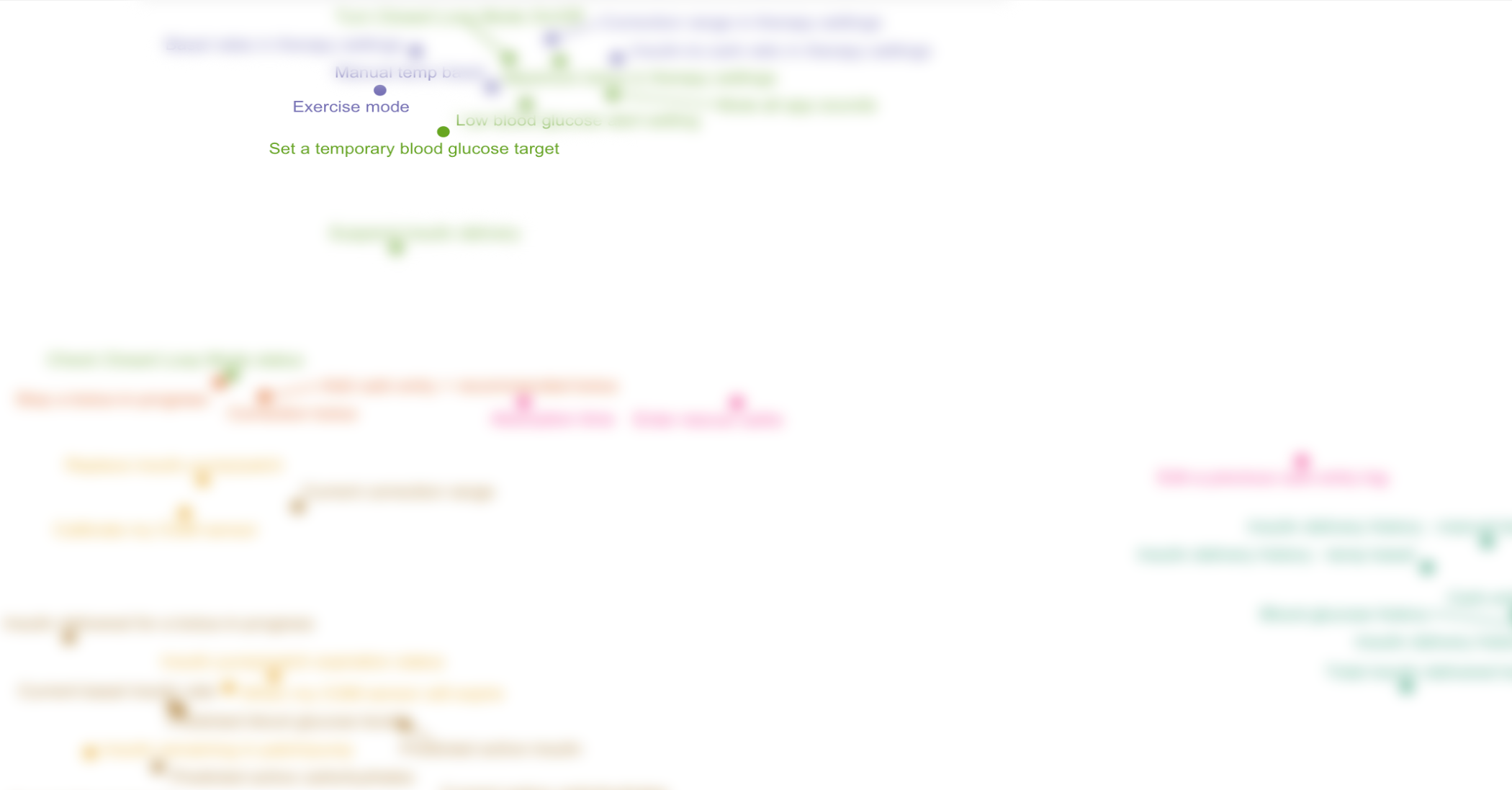
Used an exploded tree diagram to map out all functions and features of the Tidepool Loop App
Card naming approach: diversifying card wording to avoid participants grouping cards by keyword, and included duplicate cards (representing the same feature) with different wording to test if the name of a feature influences how participants group it
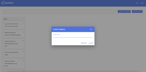
Open unmoderated card sort: an open card sorts allow for the users to create and name their own categories, and an unmoderated card sort is a resource-efficient way to collect early data
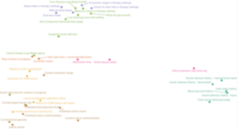
Multi-dimensional scaling (MDS) diagrams represent the overall similarity and dissimilarity between all of the cards based on how often participants put them in the same group. This method helps to show outliers, loosely spread or overlapping groups, and cards that could be put into several groups.
Hypothesis 1: Exercise Mode
1 out of 8 participants included "Set a temporary blood glucose target" and "exercise mode" in the same group.
Although the two cards were only placed in the same category by one participant, it is clear from proximity on the MDS graph that they were both grouped with other, similar cards.
“Exercise mode” is the name of the feature that allows you to “set a temporary blood glucose target,” and we would expect them to be consistently sorted into the same group
However, only 1 out of 8 participants put them in the same category, suggesting that there may be an underlying lack of understanding about how this feature works
Further research will help to determine the root cause, whether it’s wording and naming, a lack of visibility into how the system is working, negative transfer from other AID systems, or something else
"Actions"
50% of participants labeled one of their categories “actions,” suggesting that this is a way that users conceptualize the organization of an automated insulin dosing app
This supports the hypothesis that users expect to find actions in one place and will inform future design decisions in the app as new features are added
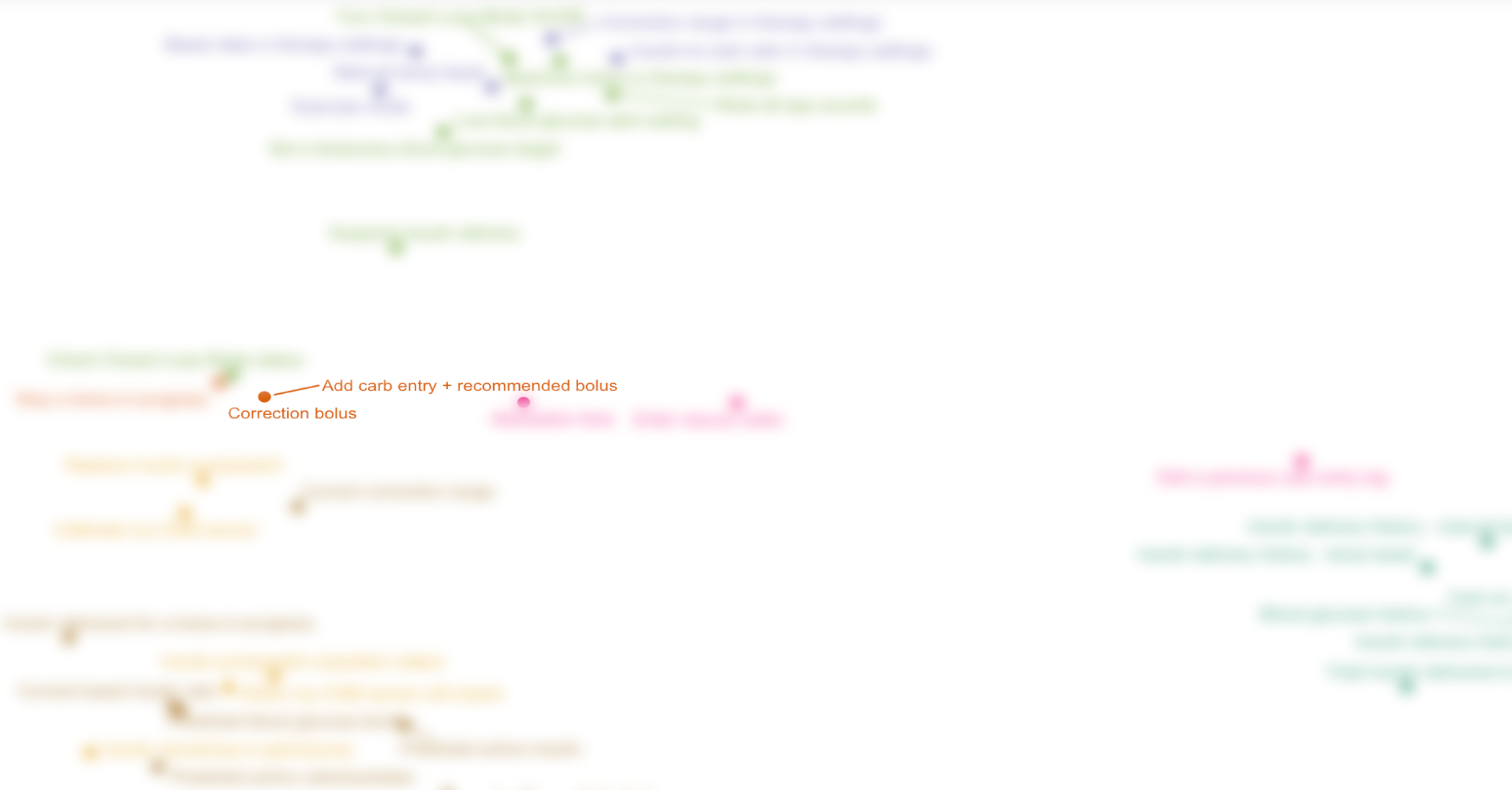
Meal Entry vs. Correction Bolus
8 out of 8 participants grouped "Correction bolus" and "Add carb entry + recommended bolus" cards together
The cards "Correction Bolus" and "Add carb entry + recommended bolus" are represented on the MDS diagram as two overlapping dots, indicating the maximum level of similarity.
8 out of 8 participants put these two cards in the same category, which may suggest that users expect to find these two features in the same place (which is not true in the current version of the app)
We recommend redesigning the navigation to have one “bolus” button which leads to either logging a meal and delivering a bolus for the meal, or delivering a correction bolus with no meal
Next Steps
The results of this study were directional and provide a starting point for further research including:
Usability testing of low-fidelity prototypes with bolus entry design updates to determine whether that information architecture redesign improves task success rate
1:1 moderated card sort study to probe deeper into users’ mental models, especially in making categories such as “actions” and what they expect to be able to do in the app
Diary study or long-term tracking of how often different features of the app are used over time to determine if the current information architecture is conducive to ease of use for the most commonly used workflows